How to Mockup Cross Stitch Color Conversions
As a designer, I have a pretty good idea of what colors work well together and the color schemes I want to use for my projects.
However, many stitchers may have a hard time visualizing if what they have in their head will look good as a final product.
This is where mockups come in handy. Mockups are a preview of what your finish piece will look like to help you decide on your palette.
Try a small pattern that is less complex if you have never switched colors for a pattern before.
Once you gain some experience and feel more confident, you can take on bigger and more intricate patterns.
I have created 4 different options for creating mockups, from very basic to more advanced.
- Printing a Grayscale Image
- Digitally Painting on a Grayscale Image
- Changing Colors Using Photo Editing Software
- Recreating the Pattern in a Pattern Software
If you haven’t already read my article on color schemes, please do so. Creating the mockup will make more sense with the lessons learned from that post. Or if you just want to wing it that’s fine too.
WANT FREE CROSS STITCH PATTERNS?
Sign up for my newsletter to get access.
Option #1 Printing a Grayscale Image
If you aren’t tech-savvy, this is probably the easiest option.
Start by selecting your pattern. Again, don’t go crazy if this is your first time trying something like this.
Next just print the image in grayscale. Your printer should have this option. The various settings will depend on everyone’s individual printers.
Use markers or crayons to fill in the different colors.
Although this method is low tech, it does come with some pitfalls. My printer only has a grayscale or monochrome option.
If the pattern has darker colors they will appear dark when you print. Your crayons or markers will have a difficult time showing up or look murky.
Because of the lack of customizability, this is my least favorite option.
At the very least, I recommend bringing the image into a photo editing software to lighten it up and even out the tones.
Option #2 Digitally Painting on a Grayscale Image
You will need photo editing software such as Photoshop or Photopea for this method. This software is not particularly for cross stitch so it won’t help with picking floss colors just creating the visualization.
Photopea is an open-source (free), web-based application so there is no need to have to install anything onto your computer. It is very similar to Adobe Photoshop and works in the same capacity for this tutorial.
Because I am a designer, I will be working in Adobe Photoshop. If you want to purchase Photoshop, they have a monthly subscription.
Opening the Image in the Application
Start by opening the application.
Once you open the application, you will be prompted to do a task. In this case, we want to open our image. The better quality and higher solution the image the better this will work.
Open > Select Image

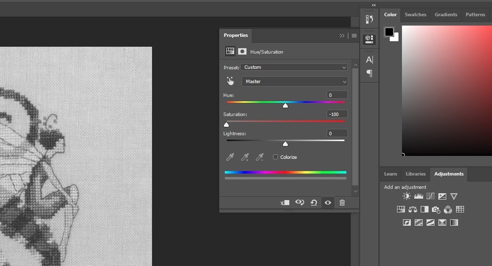
Desaturating the Image
We need to convert this image to grayscale to be able to paint on it.
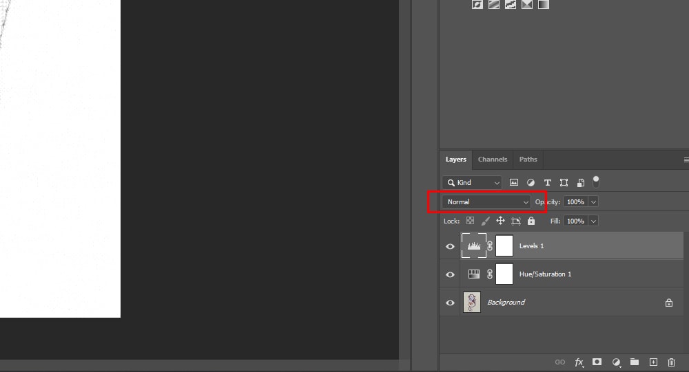
On the right of your screen, there will be different windows open by default. You should see the Adjustments panel.
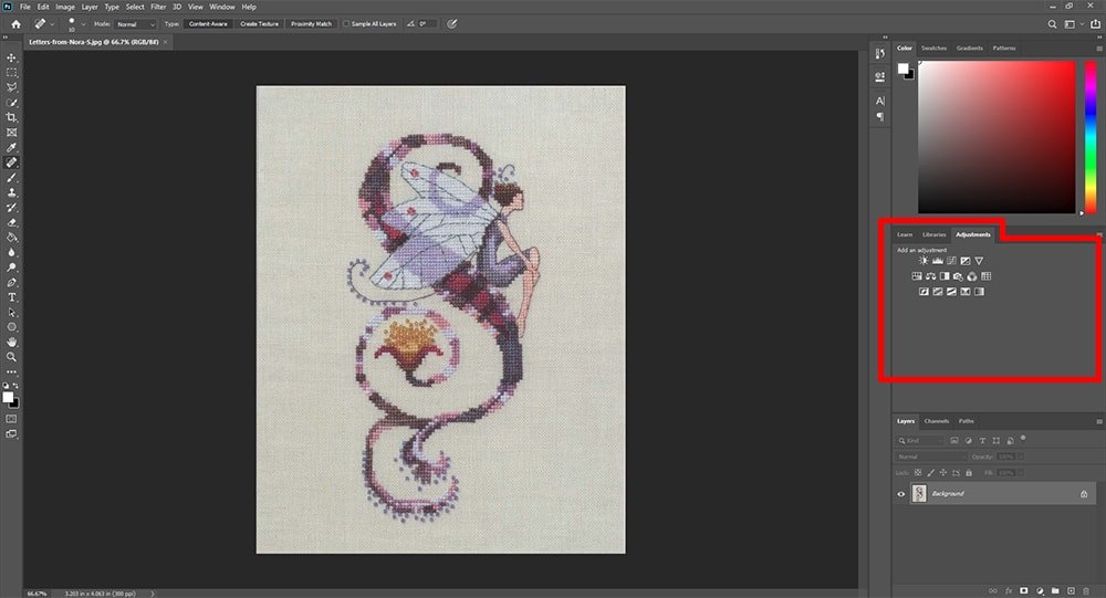
If you do not see this open go to Windows > Adjustments.
Click on the icon for Hue/Saturation. This will automatically create a new layer on top of your image in the layers panel.
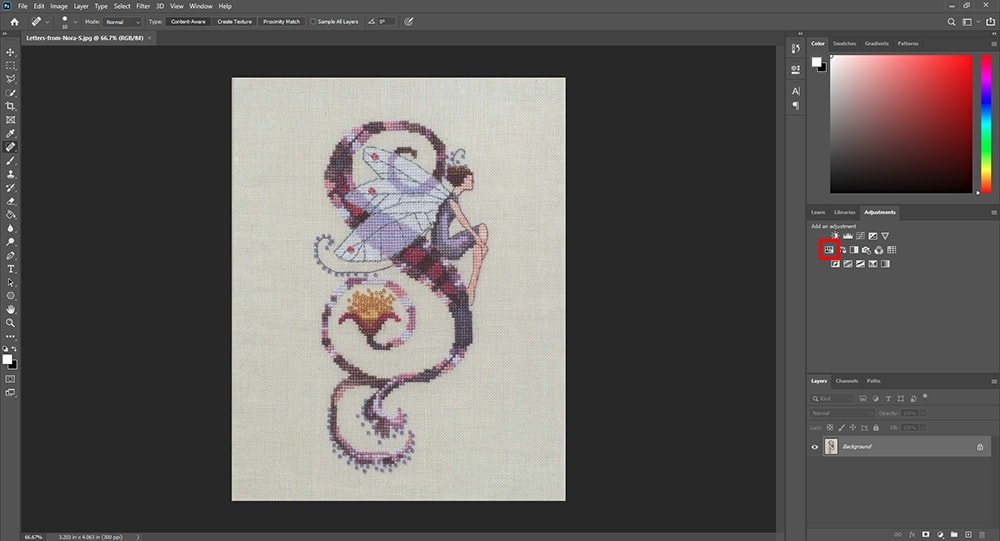
Turn the saturation down to -100.
This is a good option so that we can preserve the original. However, Photopea doesn’t have this option.
In Photopea (this works in Photoshop too), let’s create a duplicate layer so that we are not working on the original layer.
In the top menu go to Layer > Duplicate (Ctrl J). The first layer must be selected.
Image > Adjustments > Desaturate (Ctrl Shift U) will automatically desaturate the image.
Evening Out the Tones of the Image
Through the Adjustments tab click on the Levels icon or go to the top menu Image > Adjustments > Levels (Ctrl L).

Now, move the white arrow over to the left and the gray arrow to the left as well. This will lighten the entire image.
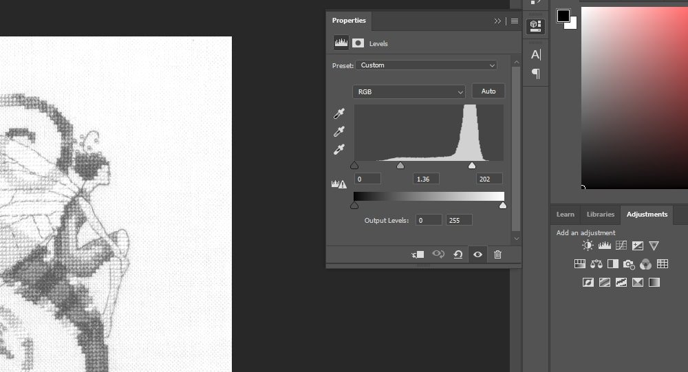
You’ll want to play around with these settings to get the best result with your image. Some images will be darker or lighter so results will vary.
At this point, if you want you can print it out and color on it like in Option #1.
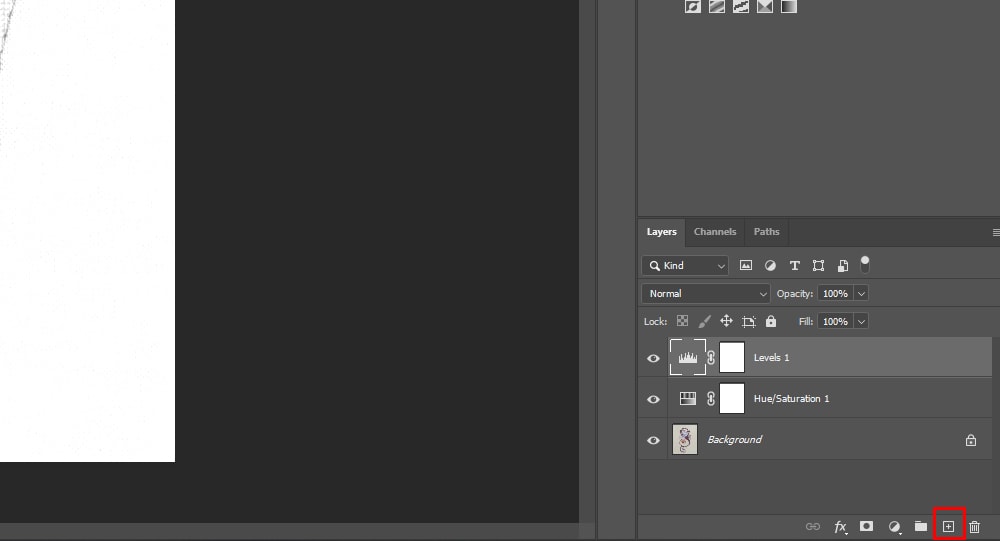
Digitally Painting the New Colors
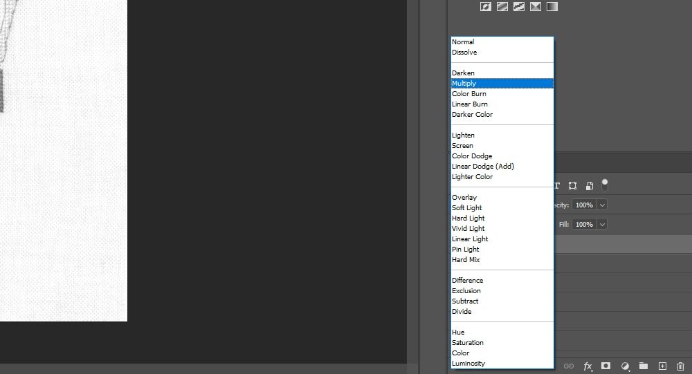
Create a new layer and set the blending mode to that layer to multiply.
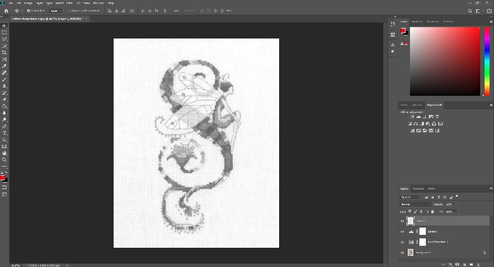
Click on the Brush tool (B) and adjust the settings. Turn the size and hardness of the brush up or down.
Then start painting on the layer you created.
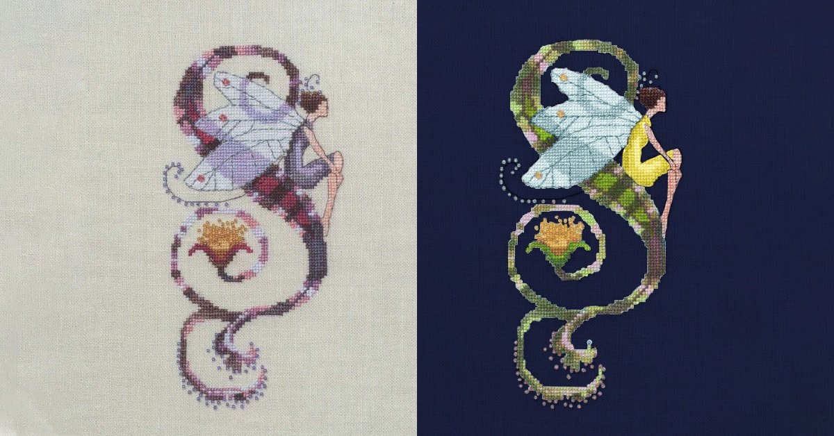
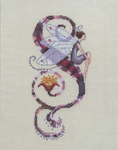
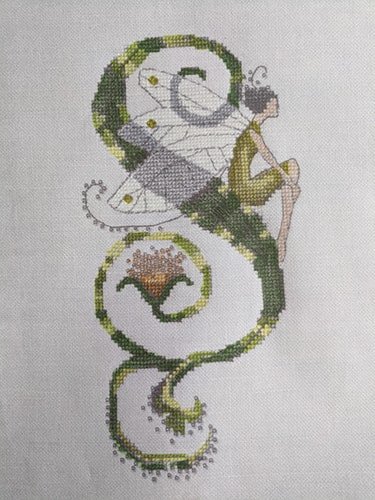
Option #3 Changing Colors Using Photo Editing Software
I get the best results with this method and this is the method I most often use.
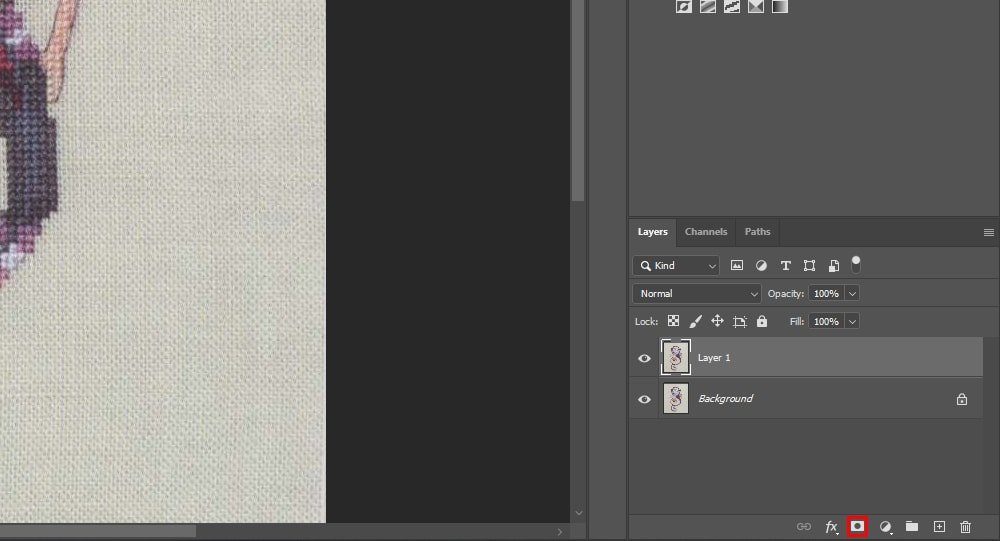
Duplicate the original layer (Ctrl J).
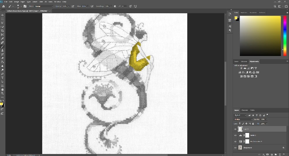
Select an area with a selection tool. You can use the quick selection tool.
Add a mask to the new layer. This is so that the color changes will only affect this area.
You can paint black and white on this layer to add or take away from your mask. White will be where your colors change and black will show transparency.
Create a Hue/Saturation layer or go to Image > Adjustments > Hue/Saturation (Ctrl U). Check the colorize button to give you an accurate color representation.
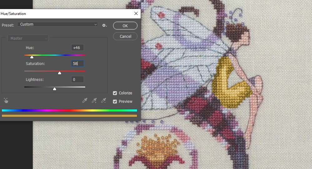
Pull the Hue slider left and right until you find a color scheme you like. You may need to drag the Saturation slider right a little bit.
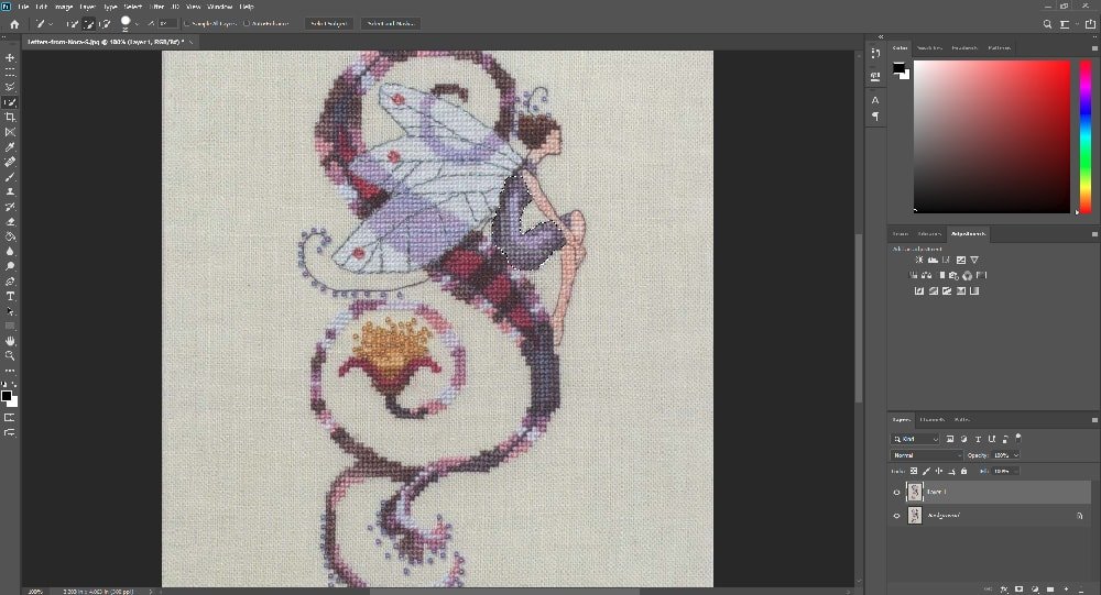
You will want to create a few layers and add masking so that you can change them to different colors.
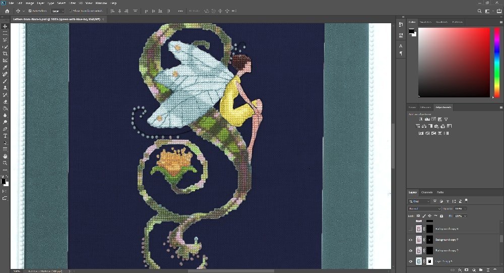
Play around until you achieve the results you want.
I will then match the floss colors to those on the screen.
Option #4 Recreating the Pattern in a Pattern Software
This is going to be the most time-consuming option. If you have a pattern making software, you can rechart the design in the software.
The process of converting colors then becomes much easier because you can switch out the floss colors right in the program.
Colors will not be perfect to what you are viewing on the screen just because everyone’s monitor displays color differently.
The process will be slightly different depending on which pattern making software you are using.
Final Thoughts
My favorite way to help visualize my color conversions are by using a digital software then choosing my colors by eye.
The colors will look different on the computer than they do in real life. By choosing flosses by eye, you will have a better representation of how your colors look together.
Once you have selected your colors, look at them next to each other and against your chosen fabric.
Throughout the process, you may decide that colors are not stitching up how you envisioned them. It’s better to rip those stitches out and choose a color that you like more than to proceed and have a project that you are not happy with.
Happy Stitching!