
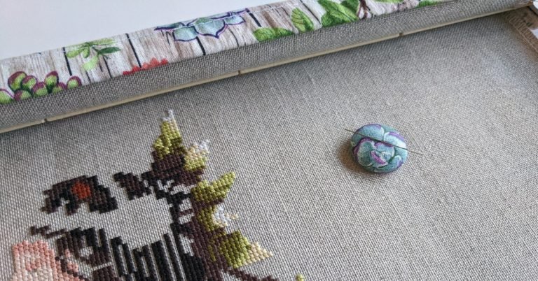
The Ultimate Guide to Changing Cross Stitch Colors
Have you ever wanted to customize your cross stitch project but weren’t sure where to start? One way to add a personalized touch is to use your own color palette.
I am proud to say that I have successfully converted colors for many of my projects. However, I know a lot of stitchers struggle with picking the RIGHT colors.
I will walk you step-by-step through the color conversion process and teach you the basics of color theory to help you transform your projects. By learning these principles you will be able to change the colors for any pattern.
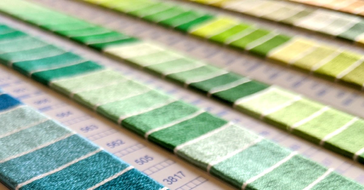
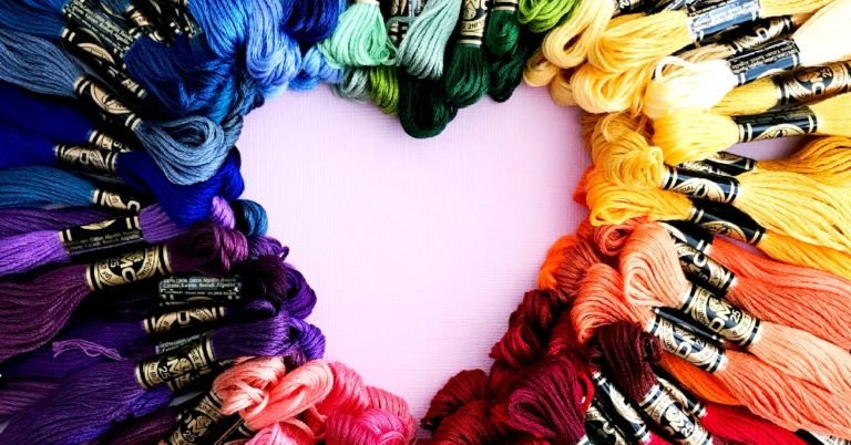
It will be helpful to refer to a color wheel and the DMC color card with real floss so that you can easily convert colors for cross stitch.
WANT FREE CROSS STITCH PATTERNS?
Sign up for my newsletter to get access.
Step #1 Start by Choosing a Color
Do you have a color in mind?
Usually, I have a key color that I want to focus on. Since my favorite color is yellow, I try to incorporate yellow into the pattern.
If the project is a gift, I like to include the recipient’s favorite color or colors. If I’m making a wedding gift, I will use their wedding colors and so on.
Having trouble deciding on a color?
Think about the overall tone or mood you want to convey. Various colors subliminally make you feel certain ways and represent different emotions. For example, my favorite color is yellow because it’s bright and cheery, and reminds me of sunshine.
What do you want your project to say? Is it sophisticated with muted tones or fun with bright hues?
These are just some concepts that I want you to keep in mind as we move forward.
Warm Colors vs Cool Colors
Warm colors, also known as advancing colors, include reds, oranges, and yellows. They are called advancing colors because they stand out and capture your attention more than cool colors.
Use warm colors to have the focal point of your project protrude forward.
Cool colors, also known as receding colors, include greens, blues, and purples. They are called receding colors because these colors get pushed backwards.
Cool colors make great backgrounds and fabric choices.
Colors can also have warm or cool undertones. This can give enough variety so that your project doesn’t blend together as much.
For example, the color violet is a cool color. However red-violet has a warm undertone compared to blue-violet which has a cool undertone.
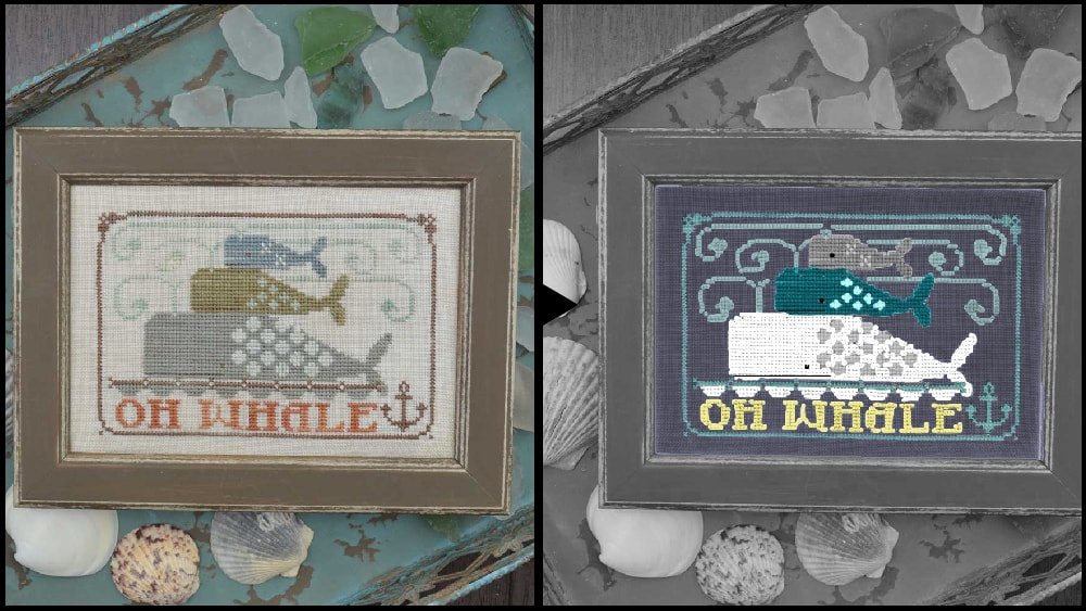
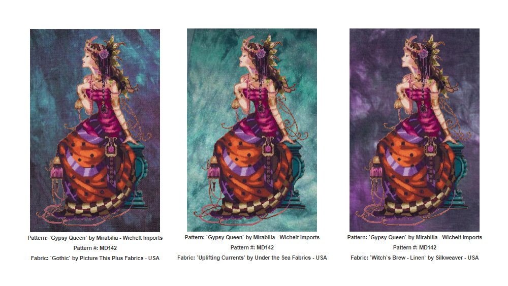
In this example, I converted colors for Oh Whale by Hands on Design. Not only did I switch the floss from Gentle Arts Sampler Threads to DMC, but I changed the palette from warm to cool colors using blues, blue-greens, and cool toned grays.
You can pick any color from DMC’s color card or pick a color from your stash. The rest of the process becomes easier once you have your initial color chosen.
Step #2 Identify Color Values
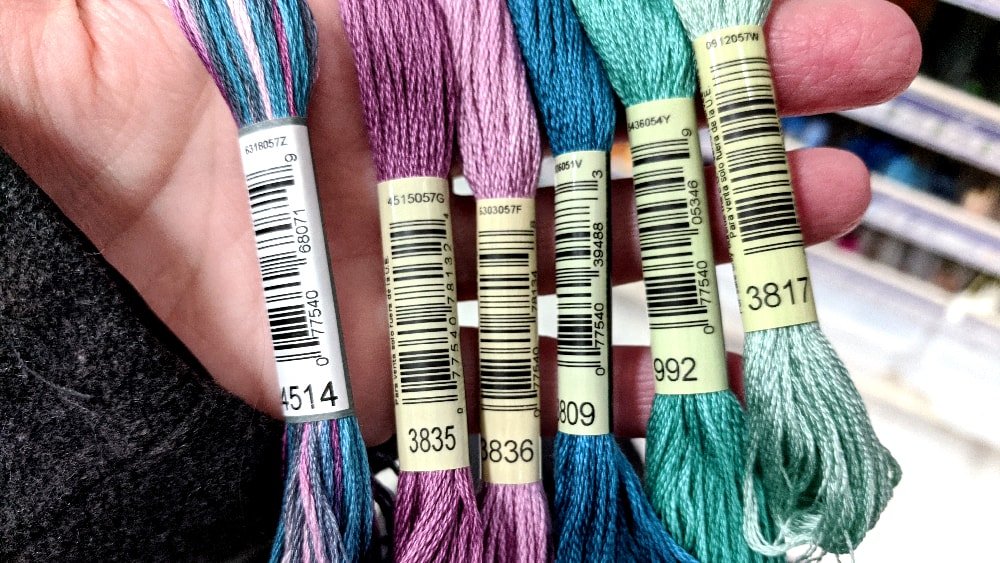
Values are the lightness or darkness of a color. Giving highlights and shading to your project will add depth. This is easily done using DMC’s color card because it groups the floss by color families.
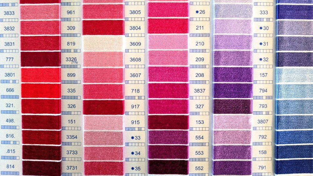
The most accurate way to convert from one color to another is by choosing colors that are the same shade. DMC names their colors variations of light, medium, and dark.
If the piece just contains solid colors and no shading, you could also use values as additional “colors.” Instead of having to choose completely different colors, use different variants of the color family.
Step #3 Pick a Color Scheme
Here’s where things may get a little complicated because we are going to use some fancy art terminology. Also, this part helps if you have a color wheel. We will be referencing the color wheel a lot.
Fear not. I will explain everything as simply as possible and provide lots of examples.
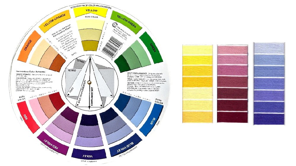
Monochromatic
Monochromatic is the use of one color utilizing lighter and darker values. This is the easiest transition because you are only using one color. In my example, I converted Peacock & Fig’s No Words Needed. The original flowers consisted of yellows, peach, and pinks (example of an analogous color scheme). I left the leaves the same as the original.
This project is a gift for one of my friends who loves the color pink, or “blush” to be more specific. I knew I didn’t want to choose vibrant, dark, or purpley-pinks.
This pattern consists of five colors in the flower altogether and because there is backstitching I didn’t mind if my colors blended together.
I stayed within the rose and dusty rose color families. Because I wanted the flowers to stay on the lighter side, I chose the lightest pink of DMC as my lightest color and medium pinks as the darkest colors.
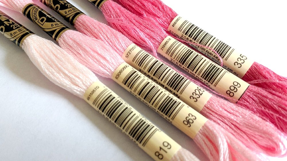
From lightest to darkest: 819 Light Baby Pink, 963 Ultra Very Light Dusty Rose, 3326 Light Rose, 899 Medium Rose, and 335 Rose.
Some of the most beautiful cross stitch projects that I’ve seen consist of a neutral, monochromatic color scheme with a pop of color. It’s so simple yet such a great way to add interest to your work.
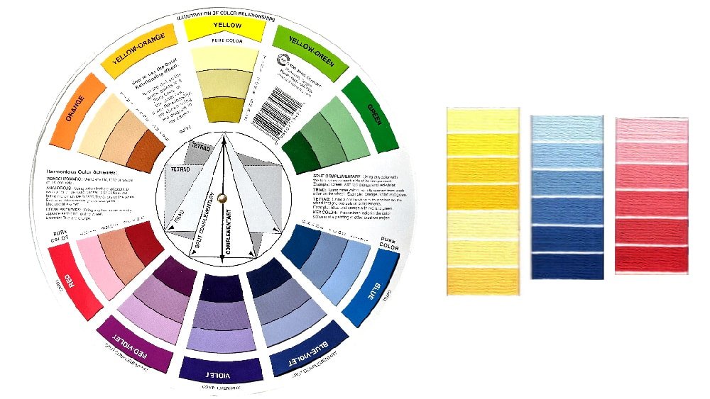
Analogous
Analogous colors are colors that are next to each other on the color wheel. An analogous color scheme will create a sense of harmony because the colors are similar in hue.
In this example of analogous colors, I stitched She is Fierce by Emma Congdon. I changed the color scheme to include purples, blues, and greens.
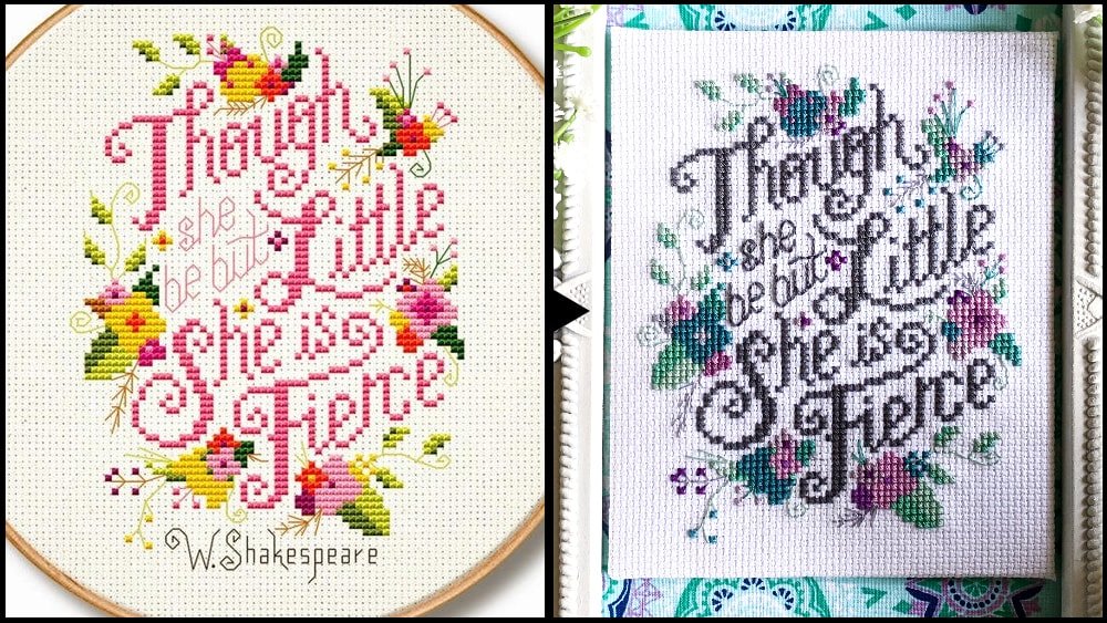
I absolutely loved this color combination! It’s so romantic and fantastical.
Unfortunately for me, this was a gift. Although I thought about keeping it, the response from the recipient was worth it.
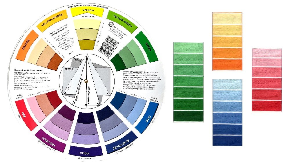
Complementary
Complementary colors create contrast because they are direct opposites on the color wheel. This color scheme will add more interest as the different colors will pop next to each other. One color will be a warm color and one a cool color.
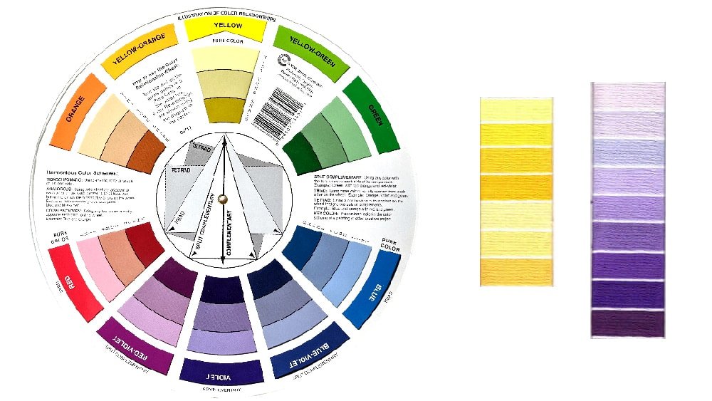
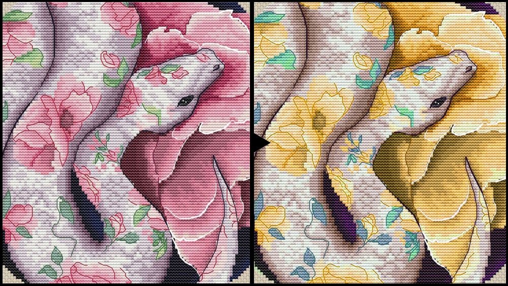
I used Photoshop to create a mockup. You can read more about the process in my tutorial where I explain how I mockup cross stitch color conversions.
The complementary colors I will be using are yellow and purple. Because yellow is a warm color, I will be using yellows for the flowers to attract your attention.
Split Complementary
Using the main color that you chose plus the colors on either side of its complement.
Triad
Triad colors create a perfect triangle on the color wheel. These three colors are equally spaced from each other.
Tetrad, Double Complementary, and Double Split Complementary
Because there are many color combinations each of these terms contains four colors on the color wheel.
Double Complementary includes two pairs of complementary colors directly next to each.
Tetrad or double split complementary colors are a combination of four colors that are two sets of complements. These create an “X” or rectangle shape on the color wheel.
Again, keep in mind these are just a few examples. You can even use five colors or more in your project, but they all follow some sort of analogous or complementary scheme at its foundation.
Step #4 Choose Your Fabric
Although choosing fabric for me is usually a last step, in many cases it could be the inspiration for floss choices. Treat the fabric color like any other floss color in terms of determining the overall color scheme.
Hand dyed fabrics are very popular right now. Keep in mind that you don’t want your stitching to get lost on a busy fabric.
Personally, I prefer solid colors or light mottling. I like to stick to a max of two or three colors that are harmonious and aren’t competing for attention.
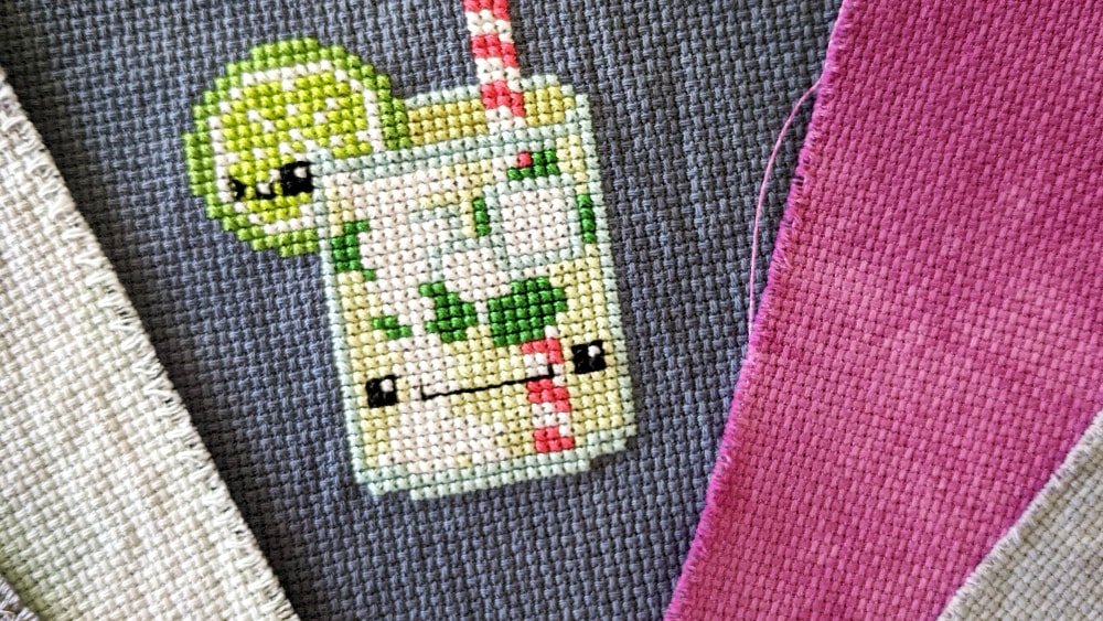
Fabrics with heavy mottling or lots of colors can be too jarring. Again, you want the main focus to be the stitching and for your fabric to complement the work.
That being said you can use whatever fabric you like. Those are just my recommendations.
FabricView.com is a great resource to see a preview of what your pattern will look like on different color fabrics. The patterns that are available for viewing are a little limited. There are mostly Mirabilias and Nora Corbertts available but the fabric selection is huge.
Resources for Getting Inspiration
There are TONS of resources that you can find online for color palettes. All it takes is a simple Google search or a trip down the Pinterest rabbit hole.
One of my favorite resources is a site called Stitchpalettes.com. This site is specifically for stitchers to discover palettes for their projects.
Using an image as inspiration, they create a palette with DMC floss. You can choose palettes based on a DMC floss code, color, scheme, category, season, or by theme.
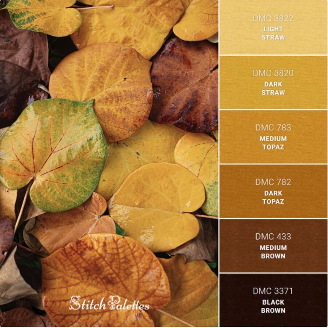
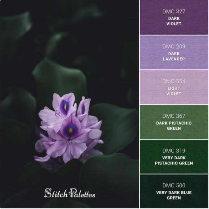
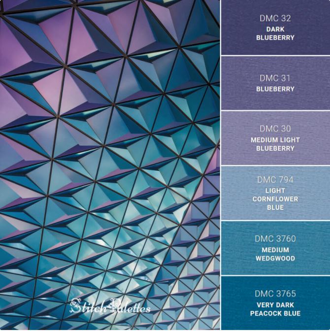
They also have a nifty tool called the palette generator that can create a custom palette for you. Simply enter in the DMC color code and the generator will create suggestions for various color schemes.
Final Thoughts
Don’t be afraid to experiment with different color combinations. Worst case scenario you will have to frog the color and try a new one. The point is to have fun and be creative.
I know it can be frustrating at times. I’ve had to rip out plenty of stitches searching for the perfect color. The payoff is always totally worth it!
In the end, you will have a finished piece that you put hours of work into, that you customized to your liking, and that you will cherish forever.
Happy Stitching!

Good Morning Stephanie, I purchased a cross stitch pattern of a Great Dane. The pattern shows a very colorful – almost Andy Warhol rendition of a Great Dane. I would like to totally customize the colors to look like our pup. I have no idea where to start – and have a rather bad eye for colors . . . Ugh. Can you help? Would you be willing to convert the colors for me — of course I would be happy to pay you to do so. I have asked the person I purchased the chart from if she could help but sadly she is in the Ukraine and is unable to get back to her home to do so . . . Very sad . . . Thanks.
Nancy
Thank you so much for your helpful text. I just purchased the chart for Seasons by Alphonse Mucha 1890s. The colours are very subdued and I want to use colours that mirror the vibrancy of each season. You have given me some ideas to get started. Much appreciated!